






Photo by SHVETS production on Pexels
You've been staring at a Google Drive folder named "CV drafts" for twenty minutes. There's a Word file from 2022 with a heading that jumped, a designed PDF you're not sure a recruiter can even parse, and another where every date wraps onto two lines. What you actually need is free resume templates you can type into, see as a real page, and export — without creating an account first, and without spending the evening fighting the layout.
I don't think people get stuck here because they lack taste. They get stuck because template shopping feels like progress, and job searching already asks you to make a hundred small decisions before anyone has even read your name.
Skip the Word download. Use a live template.
The download-and-tinker path looks like work. It rarely is. You grab a .docx, paste your bullets, watch the heading style collapse, export to PDF, and find the footer has jumped. That's an afternoon spent on a page a recruiter will skim in seconds. If you've already done that once this week, you know the particular tiredness of it — not writing, just repairing.
A live template flips the order. You type into the layout. You see the page as it will print. You switch designs without rewriting a single bullet.
Simple CV's eight templates are all free. No account, no watermark, data stays on your device, unlimited PDFs. That's the setup behind the free resume builder guide. Open the builder and leave with a file the same day.
Here's the split that actually happens. A computer-science graduate applying to a bank's graduate scheme used Clean Canvas for the portal upload — single column, nothing for a parser to shuffle — then switched to Dual Column for a 30-person startup that asked for a PDF by email. Same content. Two files. You don't rebuild the resume to change the clothes.
Comparing builders? That's a different article — the best free resume builder roundup. Here the question is which layout, and when to skip the two-column ones.
What makes a template safe for ATS
ATS means applicant tracking system: the software a large employer uses to store and search applications before a person reads them. Anyone quoting a precise ATS score for a template is guessing. I won't invent one.
What helps is boring, and that's good. Real text in a real reading order. Headings that are headings, not text boxes stacked like a magazine. Skills in the posting's wording, not a synonym you think sounds smarter — how many skills is where to cut that list down.
Column count is the decision that bites. Many parsers read top to bottom, then left to right. A two-column page can drop your email into the middle of a job description. Dual Column, Academic Chronicle, Slate Sidebar, and Sidebar Progress are still semantic documents, not Canva decoration. Single-column is still the safer bet for a strict ATS or a large corporate portal.
Default to Clean Canvas or Centered Classic unless you have a reason not to. "A human will open this PDF" is a reason. "I like the sidebar" is a weak reason when Workday is the first reader.
A photo is a separate call. Timeline Classic and Slate Sidebar can show one. Most UK and US corporate applications are safer without it — photo on resume covers the regional split.
You can change accent color in the builder without paying. Clean Canvas, for example, ships with Navy Blue, Slate Teal, and Forest Green. Pick a scheme. Don't go template-shopping because the default navy isn't your industry. The color will not get you the interview. The first bullet might.
The 8 templates
These are the eight layouts in the builder — the same files the editor uses, not mockups. Same editor. Content carries over when you switch.
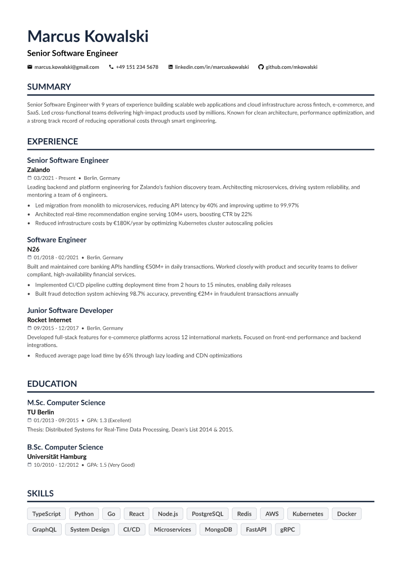
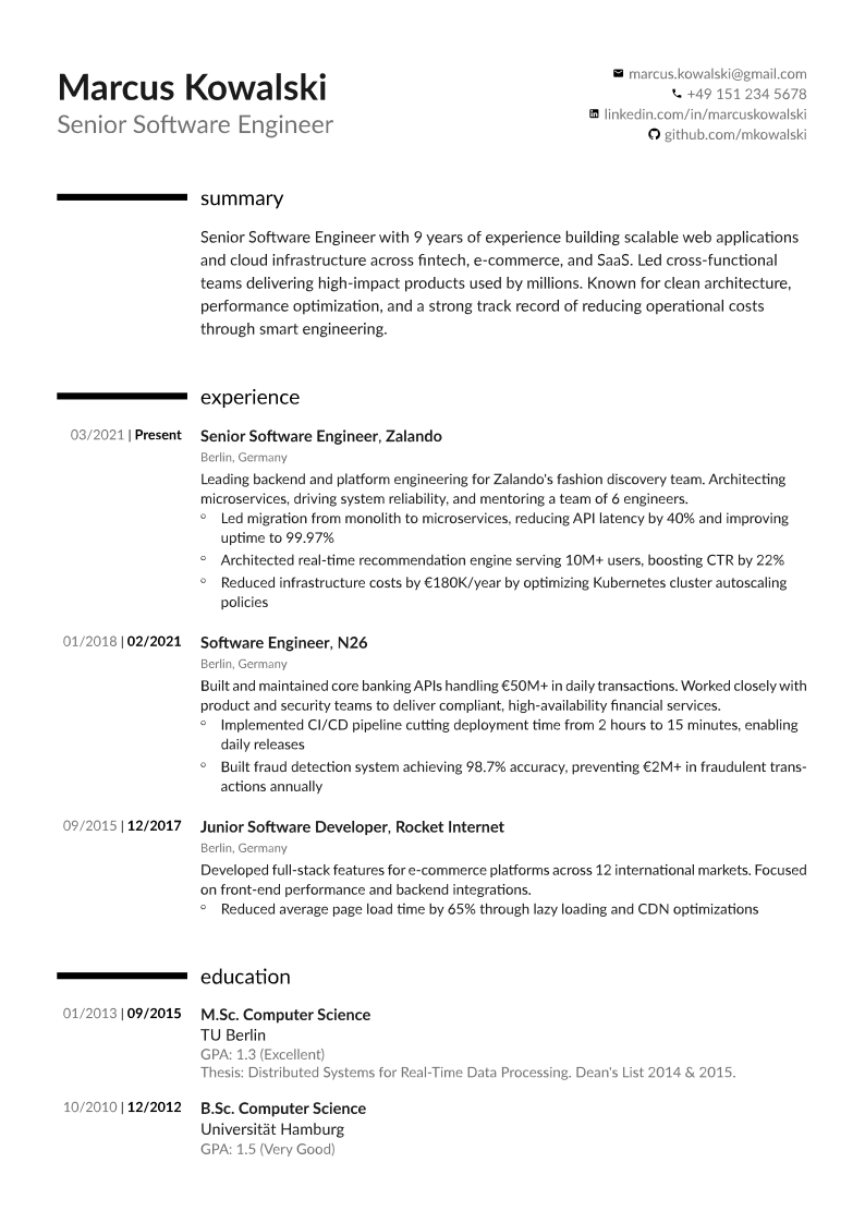
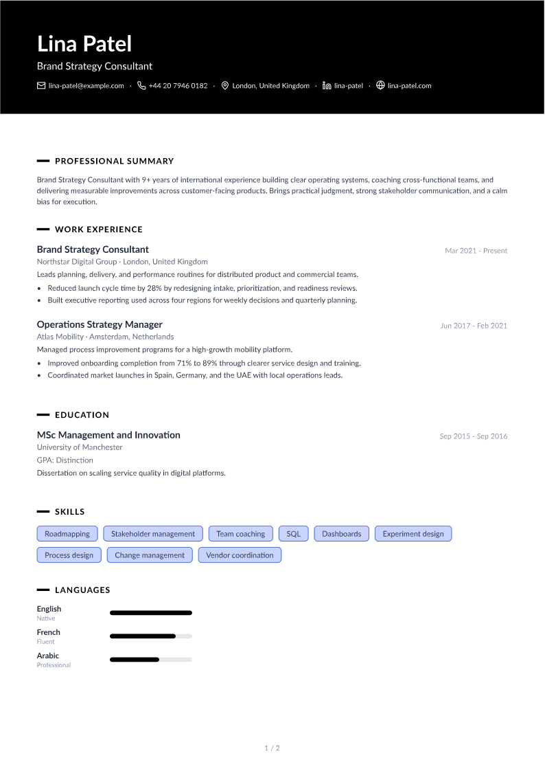
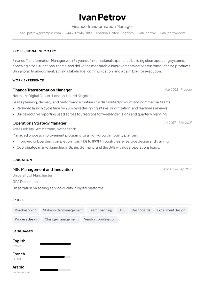
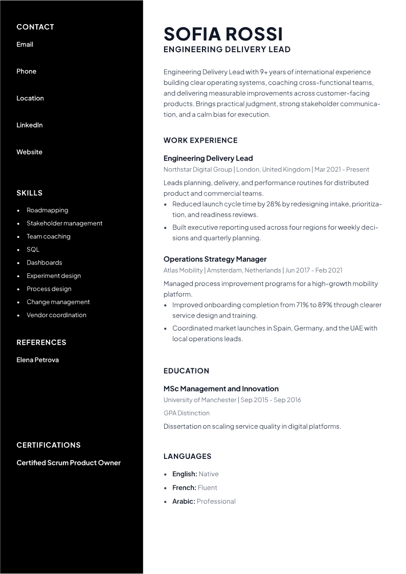
Clean Canvas
Single-column. Navy section headings, blue accents, skill pill badges, clean white background. Lato.
This is the default, and I mean that as a recommendation, not as a shrug. Corporate applications, graduate schemes, first-time users. It looks like a resume, which is the compliment. Students: use this even if you only have one internship and a project. Empty space on a clean single-column page reads as focused. Empty space on a two-column page reads as you didn't have enough to fill it — and that is a cruel reading of someone who is just starting.
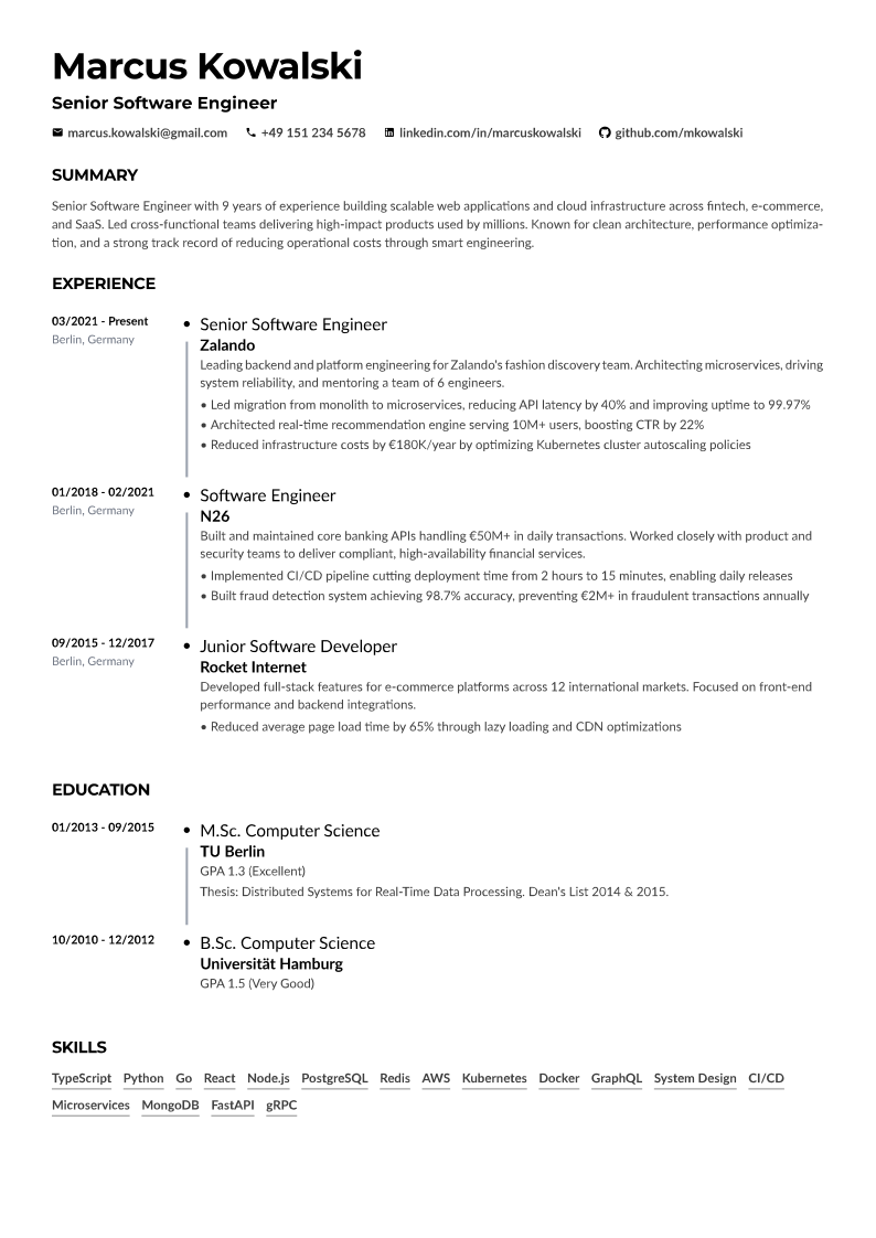
Timeline Classic
Single-column timeline for experience and education. Navy accents, Montserrat header, optional photo, underline-only skill chips.
Pick it when dates and progression are the story — internships stacked across two summers, a career change with a clear before and after, promotions you want visible without making the reader hunt. If your dates overlap or have gaps you'd rather not spotlight, skip the timeline. That isn't hiding. It's choosing not to draw a diagram of something you'd rather explain in an interview. Let Clean Canvas carry the bullets instead.
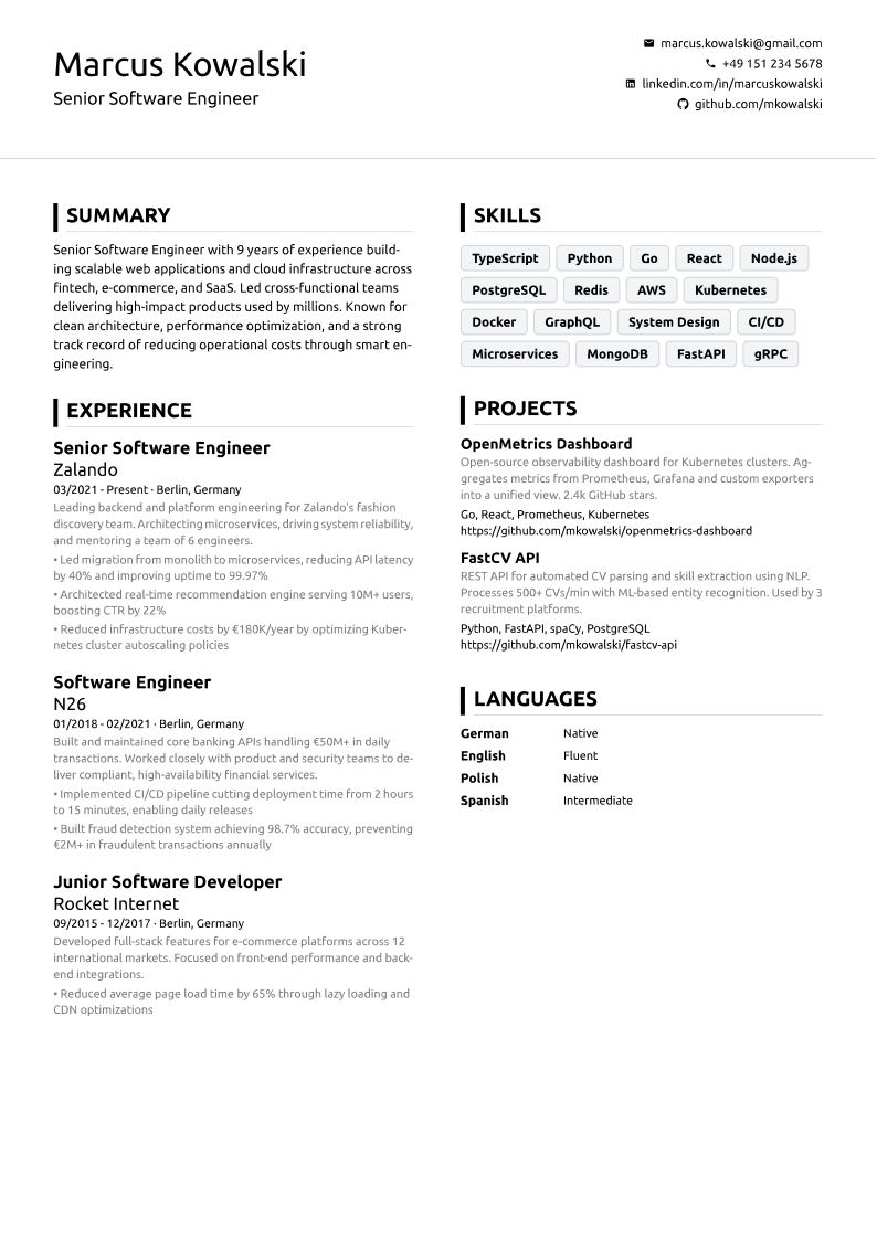
Dual Column
Two-column. Ubuntu, teal accents, skill pills, left accent bars. Left: name, summary, experience, certifications, education. Right: contact, skills, projects, languages, references.
This is the density layout. Lots of skills and certs, a project you don't want buried, a person who will actually open the PDF. For a strict ATS, don't — prefer Clean Canvas or Centered Classic. Dual Column is still a real document, not decoration, but single-column is the safer parse. The CS graduate above used Dual Column only because the startup asked for a file by email.
Academic Chronicle
Two-column inner layout with colored accent bars, date on the left and content on the right, inspired by academic CVs. Skills sit as a two-column category table.
Researchers, lecturers, PhD candidates — anyone whose CV is expected to run longer than a corporate one-pager. Publications, teaching, grants, dates that need to line up: this is the structure. Some university portals are as fussy as corporate ones. Keep a Clean Canvas export for the black box and send Academic Chronicle to people. You should not have to flatten a teaching record because a US blog said one page.
Royal Banner
Single-column with a full-width accent header banner, dash-style section headings, right-aligned dates, skill pills.
The banner does the first-impression job so the rest of the page can stay a document, not a poster. Useful when a hiring manager opens attachments. Less useful when software is the first reader — though it's still single-column, so it's an ATS-safer flourish than a sidebar.
Centered Classic
Single-column, centered name and title, dot-separated contact line, blue headings, skill pills.
The recruiter-familiar layout. Traditional without looking like a 2009 Word wizard. If Clean Canvas feels too plain and Dual Column feels like a risk, this is the middle: same single-column safety, a little more ceremony at the top. Corporate, public sector, law-adjacent — anything where "this looks like a resume" is the actual brief.
Slate Sidebar
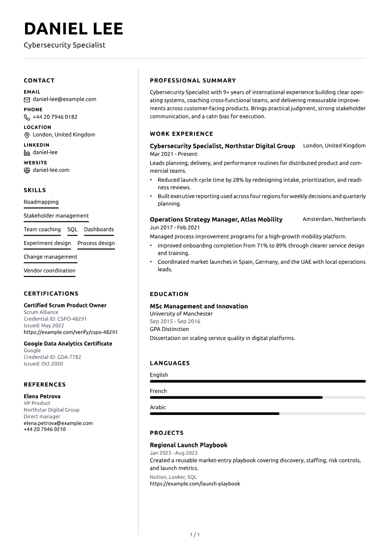
Two-column with a dark sidebar for photo, labeled contact, skills, and languages; white main column for name, summary, experience, and education.
Use it when a human will open the PDF — agencies, design-adjacent roles, a hiring manager who asked you to send the file. The sidebar is visual work, and that work is wasted on a parser. The safer ATS pick is a single-column template. Wanting the page to look cared-for is a human instinct. Just match it to a human reader.
Sidebar Progress
Two-column, full-width header with uppercase name and title; sidebar for contact, a skill list, and language progress bars; experience with right-aligned locations.
The language bars are the tell. If you need Arabic, English, and French readable at a glance, this layout makes that obvious. If you don't have languages worth a bar, use Clean Canvas or Dual Column instead. Fine for a human. Second choice for a portal.
Pick one in 30 seconds
Unsure, student, corporate, or applying through a large portal: Clean Canvas. Same safety with a centered header: Centered Classic.
Dates and promotions are the story: Timeline Classic.
Too many skills and certs, and a person will read the PDF: Dual Column.
Academic CV: Academic Chronicle.
Want a banner, still single-column: Royal Banner.
Agency or design-adjacent, and a human opens the file: Slate Sidebar.
Languages as a visible scale: Sidebar Progress.
Don't sample all eight for a week. I say that kindly. Template shopping is a stall that feels like progress, and you do not owe the process a perfect aesthetic before you are allowed to apply. Pick the constraint — ATS or human, short or long, languages or not — take the matching layout, and spend the time on bullets. You can switch later. The content carries over.
If this part of the process has you stuck, you're not alone. Close the comparison tabs. Open the builder, drop in what you already have, and export a clean PDF. You can change the template, and the accent color, without paying or creating an account.
Ready to put this into practice?
Build your CV free